
.webp)
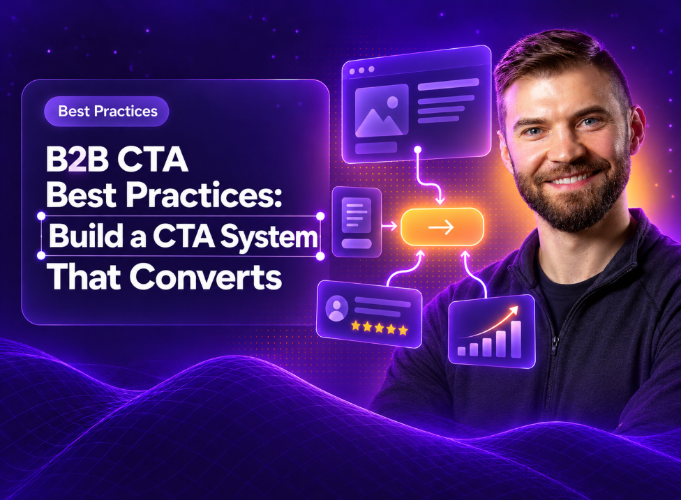


Why Single CTAs Are Killing Your B2B Conversions (And What to Do Instead)
Find out how to improve your conversions in days not months.
Key Takeaways
Most B2B SaaS websites funnel every visitor toward a single CTA: "Book a Demo." It is clean, it is simple, and it is leaving conversions on the table.
The assumption underneath it is that every visitor arrives ready for the same action. They do not. This guide covers how to build a CTA system that matches different intent levels, from copy and design to placement and testing.
Why Single CTAs Underperform on B2B SaaS Websites
Single CTAs underperform because B2B buyers show up at completely different stages of readiness, and one button can only serve one of them.
A CTA, or call to action, is any element that prompts a visitor to do something specific: click a button, fill out a form, start a trial. High-converting CTAs share three traits: clear copy, high visual contrast, and strategic placement. Intent alignment matters as much as any of them, and it is what most B2B sites miss.
Some visitors are already comparing vendors when they land on your homepage. In 6sense's 2025 Buyer Experience Report, based on more than 4,000 B2B buyers, 94% of buying groups had ranked a preferred vendor before first sales contact, and buyers were roughly 60% through their research before reaching out.
Other visitors just learned a solution like yours exists. Without website personalization, you are offering "Book a Demo" to both groups, asking the researcher for too much, too soon. The ready buyer might convert. The researcher bounces.
That gap is a strategy problem, and it has a strategy fix.
What Makes a CTA Effective in a B2B Buying Journey
B2B buying cycles run longer than consumer purchases and involve more people. A visitor might spend weeks educating themselves, sharing resources with colleagues, and building internal buy-in before they are ready to talk to anyone in sales.
Effective CTAs account for this. Your copy tells visitors exactly what happens next and what they get out of it. Your button design creates enough contrast to stand out immediately. Your placement puts CTAs where intent peaks rather than wherever the layout has room.
The difference between B2B and B2C CTAs comes down to commitment. A consumer might buy on impulse after one visit. A SaaS buyer does most of their evaluation before they ever talk to you, so your CTAs have to meet them wherever they are in that longer journey.
How to Balance Primary and Secondary CTAs on Every Page
The fix for single-CTA syndrome is to pair a primary CTA with a secondary alternative. Your primary CTA captures high-intent visitors ready to engage sales. Your secondary CTA gives everyone else a lower-commitment path forward.
Think of it as offering two doors. Both lead deeper into your funnel, and they require different levels of commitment to open.
The key is visual hierarchy. One CTA dominates the section while the other stays visible but clearly secondary. When two buttons compete for attention with equal weight, visitors often pick neither.
CTA Best Practices That Increase B2B Conversions
1. Anchor Every CTA to a Specific Funnel Stage
Your homepage CTA and your blog post CTA should differ. Top-of-funnel content converts better with educational offers like guides or webinars. Bottom-of-funnel pages, like pricing or product pages, can push harder toward demos or trials.
2. Lead With the Value the Visitor Gets
"Submit" tells visitors what they do. "Get My Free Audit" tells them what they get. The second version tends to outperform because it answers the visitor's real question: what is in it for me?
3. Offer a Low-Friction Alternative Next to the Primary CTA
Pairing "Talk to Sales" with "Watch a 2-Min Overview" captures visitors who are interested but not ready to commit. You keep them in your ecosystem instead of losing them to a competitor's blog.
4. Match CTA Intent to Page Intent
A pricing page visitor is evaluating cost. A blog reader is gathering information. When your CTA ignores that context, conversions drop. On the B2B landing pages we have tested, swapping a generic "Contact Us" for a CTA that names the page's purpose is one of the most reliable lifts available.
5. Design for Scannability and Visual Hierarchy
Your CTA button has to pop against the page background. Contrasting colors, adequate sizing (at least 48px for mobile tap targets, per Google's accessibility guidance), and enough white space to isolate the button from surrounding clutter all contribute.
6. Reduce Perceived Risk With Supporting Microcopy
Microcopy is the small text near a CTA that eases anxiety. A few words can dramatically reduce friction, such as the following:
- "No credit card required"
- "Free for 14 days"
- "Cancel anytime"
- "Takes 30 seconds"
7. Keep One Dominant Action per Section
A page can carry several CTAs as long as each section has one that is visually dominant. The specific action can change as visitors scroll; the hierarchy within each section should not.
How to Write CTA Copy That Converts B2B Buyers
Use Action Verbs Tied to Buyer Outcomes
Strong CTAs start with a command word that implies forward motion. Verbs like Get, Start, Download, Schedule, See, and Access outperform passive alternatives because they create momentum.
Replace Generic Phrases Like "Learn More" and "Submit"
Vague CTAs create hesitation. Specific CTAs create clarity. The shift looks like this:
- "Submit" becomes "Get My Free Report"
- "Learn More" becomes "See How It Works"
- "Click Here" becomes "Start Your Free Trial"
Add Specificity, Numbers, or Social Proof
Specificity builds trust. "Join 500+ SaaS Teams" feels more credible than "Join Our Community." "See Results in 7 Days" sets clearer expectations than "See Results Fast."
CTA Button Design and Visual Hierarchy Best Practices
Design choices affect conversion rates more than most teams realize, and the best B2B websites show it. Your button color matters less than whether it contrasts with your page background. A bright orange button on an orange hero section disappears, no matter how "conversion-optimized" that color supposedly is.
Size matters for usability. Buttons smaller than 48px become frustrating on mobile devices. White space around your CTA prevents cognitive overload and draws the eye naturally.
Interactive states, like hover effects and focus indicators, signal that the button is clickable. Small details, and they build confidence for first-time visitors unfamiliar with your site.
Where to Place CTAs Across a B2B Landing Page
Above the Fold
Your primary CTA belongs in the hero section, where visitors see it immediately without scrolling. This captures high-intent visitors who arrive ready to act.
After Value Proof Sections
Place CTAs after testimonials, feature explanations, or case study snippets. Visitors are primed to act after seeing evidence that your product delivers.
Inside Feature and Pricing Blocks
Embed contextual CTAs within content sections as well as at the end. A feature block explaining your analytics dashboard can include a "See Analytics in Action" button right there.
In the Sticky Navigation and Footer
Persistent CTAs catch visitors who scroll past the hero. Footer CTAs capture readers who make it to the bottom, which signals real interest.
Common CTA Mistakes That Hurt Conversion Rates
Using Vague or Passive Copy
"Learn More" tells visitors nothing about what they will learn or why it matters. That ambiguity creates hesitation at the exact moment you want confidence.
Competing CTAs With Equal Visual Weight
When two buttons look equally important, visitors experience decision paralysis. One CTA per section has to be visually dominant.
One CTA for Every Funnel Stage
Forcing "Book a Demo" on awareness-stage blog content repels early researchers. In Gartner's March 2026 survey of 646 B2B buyers, 67% said they prefer a rep-free buying experience, and pushing them toward sales before they have asked feels tone-deaf.
Ignoring Mobile Tap Targets and Spacing
Buttons that are too small or too close together frustrate mobile users. In the B2B sites we audit, a large share of first-visit research traffic arrives on phones, so this oversight costs real conversions even when the eventual demo request happens on desktop.
How to Test and Measure CTA Performance
1. Set a Baseline Conversion Rate
Before testing anything, know your current click-through and conversion rates. Define what "conversion" means for each CTA, whether that is a click, a form submission, or a completed signup.
2. Isolate One Variable per Test
Test copy, or color, or placement, one at a time. Isolation produces actionable insights. Running A/B tests on everything simultaneously tells you something changed and hides what caused it.
3. Segment Results by Traffic Source and Page
A CTA that works for organic traffic might fail for paid campaigns. Analyze by source, device, and page type rather than relying on aggregate numbers.
4. Roll Winners Into a CTA System
Document what works and apply patterns across your site. A CTA system beats one-off optimizations because it compounds improvements over time. For a sequenced two-week version of this process, see our guide to improving conversion rate on a Webflow site.
High-Converting B2B SaaS CTA Examples
A few examples that illustrate the principles above:
- "Start My Free Trial": First-person, value-focused, low friction
- "See Pricing": Low-commitment alternative for evaluating buyers
- "Get the Playbook": Specific, tangible outcome
- "Schedule a 15-Min Call": Time-bound, sets clear expectations
- "Watch the Demo": Visual learners can self-serve before sales
Each one communicates what the visitor gets, and the action follows from that.
Build a Conversion-Focused CTA System With Curio Digital
CTAs are part of a larger conversion system that spans your entire site. At Curio Digital, we build B2B SaaS websites in Webflow with CTA strategy baked into the design from day one, so your site guides visitors toward action at every stage of their journey.
Frequently Asked Questions About CTA Best Practices
How many CTAs should a B2B landing page have?
One primary CTA per section, with optional secondary CTAs for different intent levels. The total count matters less than visual hierarchy and intent alignment.
Does CTA button color actually affect conversion rates?
Contrast matters more than any specific color. The button has to stand out from your page's color palette, and no single color universally outperforms others.
How often should you A/B test CTAs?
Test continuously, but only when you have enough traffic to reach statistical significance. Prioritize high-traffic pages where small improvements compound into meaningful gains.
What's next?




Let's build something worth finding.
Every engagement starts with a conversation. We'll learn about your business, your buyers, and where your website is losing them.