

.webp)


SaaS Pricing Page Best Practices
Find out how to improve your conversions in days not months.
Key Takeaways
Your pricing page is where curiosity turns into commitment. It is the moment a visitor stops browsing and starts calculating whether your product fits their budget and their workflow.
This guide covers the pricing models that shape page design, the best practices that drive conversions, real examples worth studying, and the metrics that tell you whether your page is working.
What Is a SaaS Pricing Page?
A SaaS pricing page is the page where a software company displays its subscription plans, pricing tiers, and feature breakdowns. The best ones rely on a clear three-tier structure, prominent value metrics, and transparent plan comparisons to reduce decision fatigue.
This page sits at a critical point in the buyer journey. By the time someone clicks over to pricing, they have moved past casual browsing and are actively weighing whether your product fits their budget and their workflow.
Why Your SaaS Pricing Page Drives Revenue
Your pricing page attracts some of the highest-intent traffic on your entire website. Blog readers might be researching a problem. Homepage visitors might be curious. Pricing page visitors are evaluating a purchase.
That intent difference matters. A small conversion rate improvement on your pricing page often moves the revenue needle more than the same improvement on a lower-intent page like your blog or about section.
Your pricing page also functions as a trust signal. A confusing layout or outdated design suggests the product itself might be disorganized. A clear, well-structured page signals that you have thought carefully about how customers experience your product from the start.
SaaS Pricing Models That Shape Page Design
The pricing model you choose affects what information you display and how you structure your tiers. Each of the common models translates into a different layout.
Flat-Rate Pricing
One price, one product. This is the simplest to display, and you will typically see a single prominent price card with a feature list below it. The tradeoff is limited upsell opportunity.
Tiered Pricing
Multiple packages at different price points. This is the most common SaaS model. The design challenge is creating clear visual differentiation between tiers so visitors can quickly identify which plan fits their situation.
Usage-Based Pricing
Price scales with consumption, such as API calls, data storage, or active users. Pages using this model often include a calculator or slider so visitors can estimate costs before committing.
Per-User Pricing
Price multiplied by seat count. Common in collaboration tools. The page typically includes a seat selector or input field that updates the displayed price dynamically as visitors adjust the number.
Freemium and Free Trial
A free tier or time-limited trial serves as the entry point. This affects your CTA language and page hierarchy, since you are optimizing for trial signups rather than immediate purchases.
SaaS Pricing Page Best Practices That Convert
1. Lead With Clarity Over Cleverness
Avoid clever tier names or internal jargon. Visitors want to understand what each plan includes within seconds, and decoding your naming conventions gets in the way.
Plain language works better. Names like "Starter," "Professional," and "Enterprise" immediately communicate who each tier is for. Names like "Spark," "Ignite," and "Blaze" require extra mental processing that slows down decision-making.
2. Structure Tiers Around Buyer Personas
Each tier works best when it maps to a specific buyer segment. Your entry tier might target solo users or small teams, your mid-tier serves growing companies, and your top tier addresses enterprise needs.
When someone sees "For teams of 10–50" under a tier name, they know immediately whether to keep reading or move on. That self-selection saves time for everyone.
3. Design a Strong Visual Hierarchy
Use visual hierarchy (size, color, and placement) to guide attention to your recommended plan. Most SaaS companies highlight one tier as "Most Popular" or "Best Value" to reduce decision fatigue.
Visual anchoring gives visitors a starting point. Without it, they are forced to evaluate all options equally, which often leads to no decision at all.
4. Write CTAs That Match Buyer Intent
"Start Free Trial" works differently than "Contact Sales." Lower tiers benefit from low-friction CTAs that let visitors get started immediately. Enterprise tiers can use "Talk to Sales," since buyers at that level expect a conversation.
- Entry tier: "Start Free Trial" or "Get Started Free"
- Mid-tier: "Start Trial" or "Choose Plan"
- Enterprise tier: "Contact Sales" or "Request Demo"
Asking someone to "Schedule a Demo" for a $29 per month plan creates unnecessary friction.
5. Add Trust Signals Near the Price
Place social proof close to pricing information. Logos of recognizable customers, brief testimonials, or security badges reduce purchase anxiety right at the decision point.
Trust signals perform best when they appear within the same viewport as the price itself. The effect is well documented: in a 2017 survey of 548 B2B professionals by G2 and Heinz Marketing, 92% said they were more likely to purchase after reading a trusted review. Put that proof where the buying decision happens.
6. Include a Feature Comparison Table
A scannable table showing which features are included in each tier reduces back-and-forth scrolling. Use checkmarks and clear labels so visitors can quickly verify that their required features are included.
This is especially important for technical buyers who want to confirm specific capabilities before moving forward.
7. Answer Objections With an On-Page FAQ
Address common hesitations directly on the pricing page. Questions about billing, cancellation policies, and implementation time are predictable, so answer them before visitors leave to find answers elsewhere.
SaaS Pricing Page Examples Worth Studying
Webflow
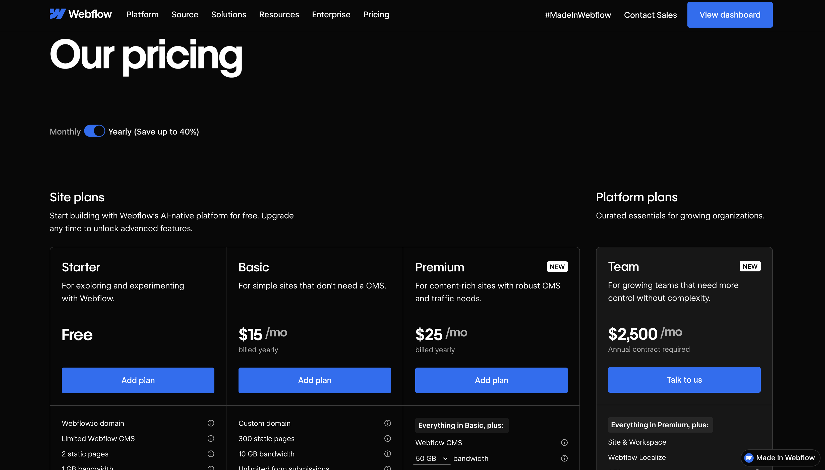
Webflow's pricing page demonstrates clear tier differentiation and strong visual hierarchy. Site plans are separated from workspace plans, which helps visitors understand exactly what they are paying for, even though the two-axis model adds a step to the decision.
Notion
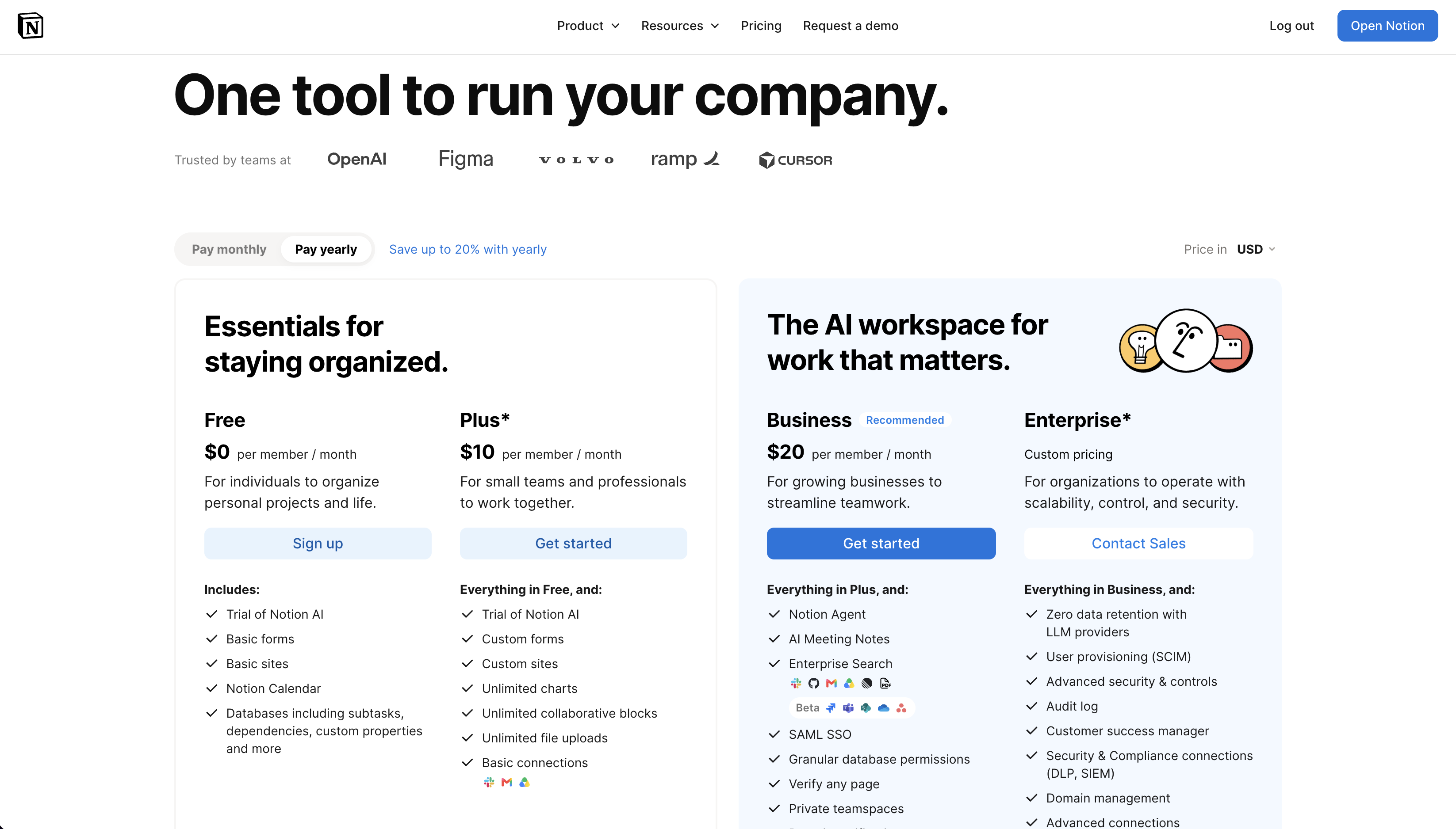
Notion uses a clean layout with a prominent Free tier that reduces friction for new users. The simplicity makes it easy to compare options without feeling overwhelmed.
Linear
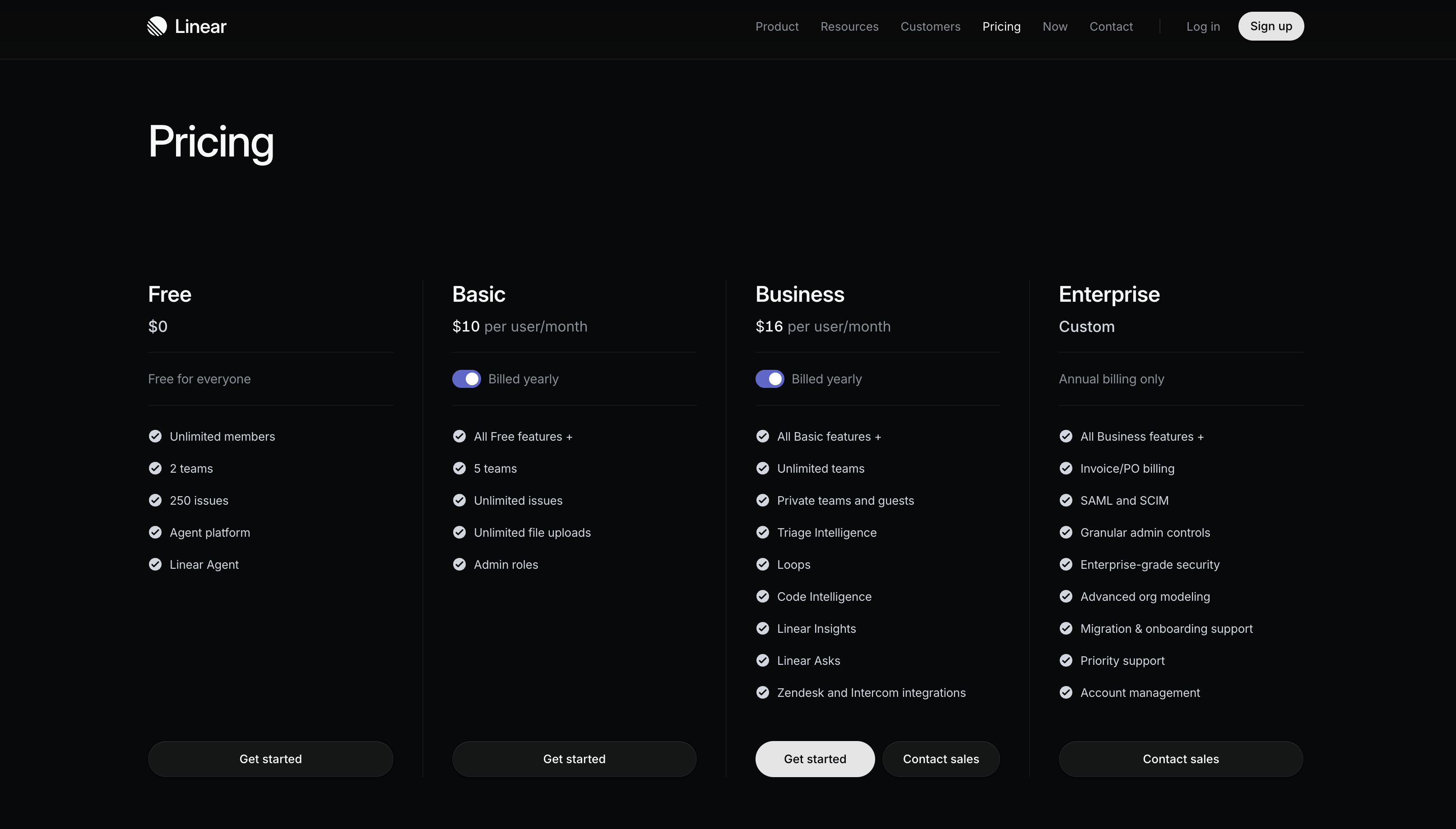
Linear's minimalist design reduces cognitive load for a technical audience: Free, Basic, Business, and Enterprise, with per-user prices shown publicly on the first three and a full feature matrix underneath. The page strips away everything else and lets the pricing speak for itself.
Figma
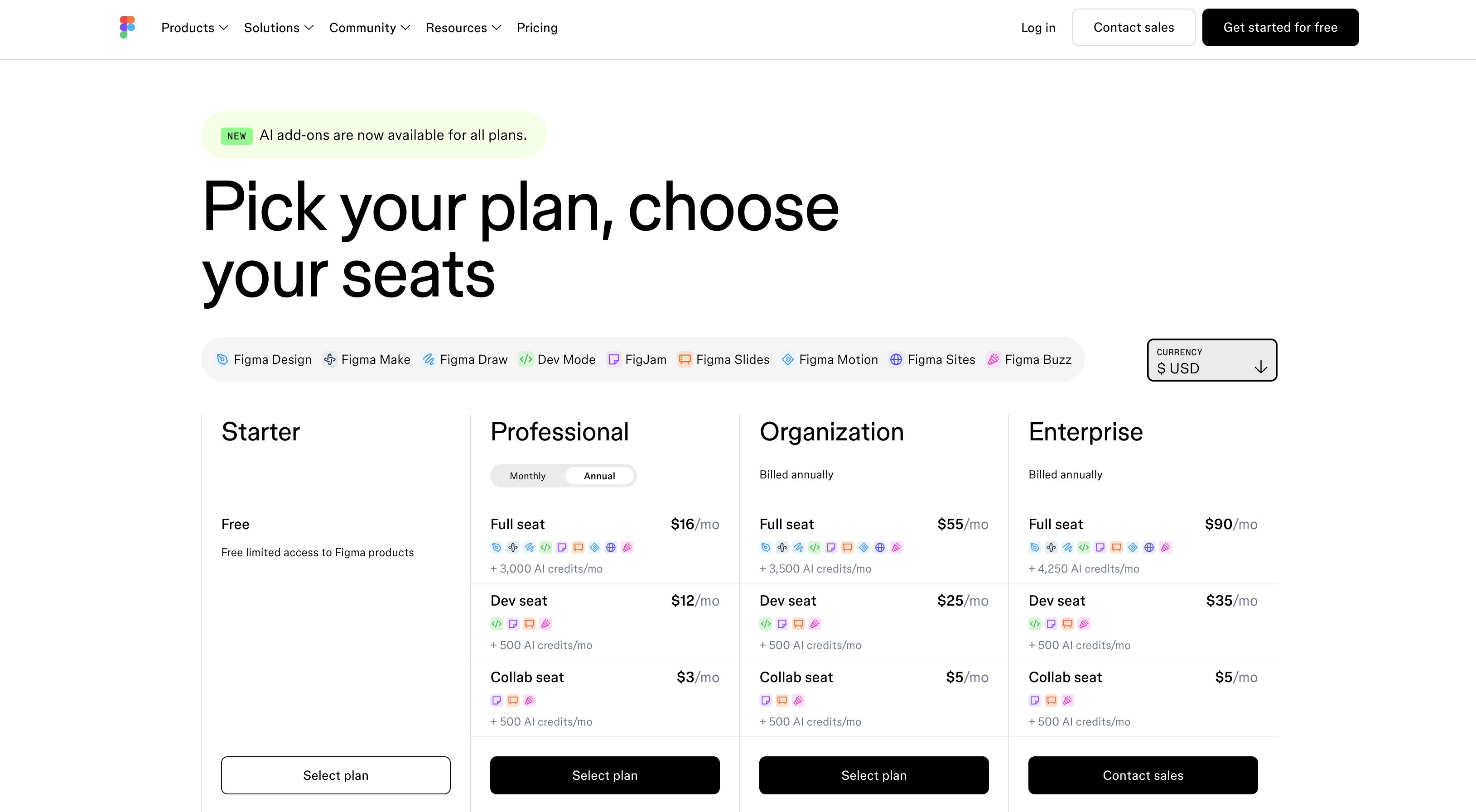
Figma handles the complexity of role-based pricing well. The page clearly distinguishes between team and enterprise tiers while keeping the page scannable.
Ahrefs
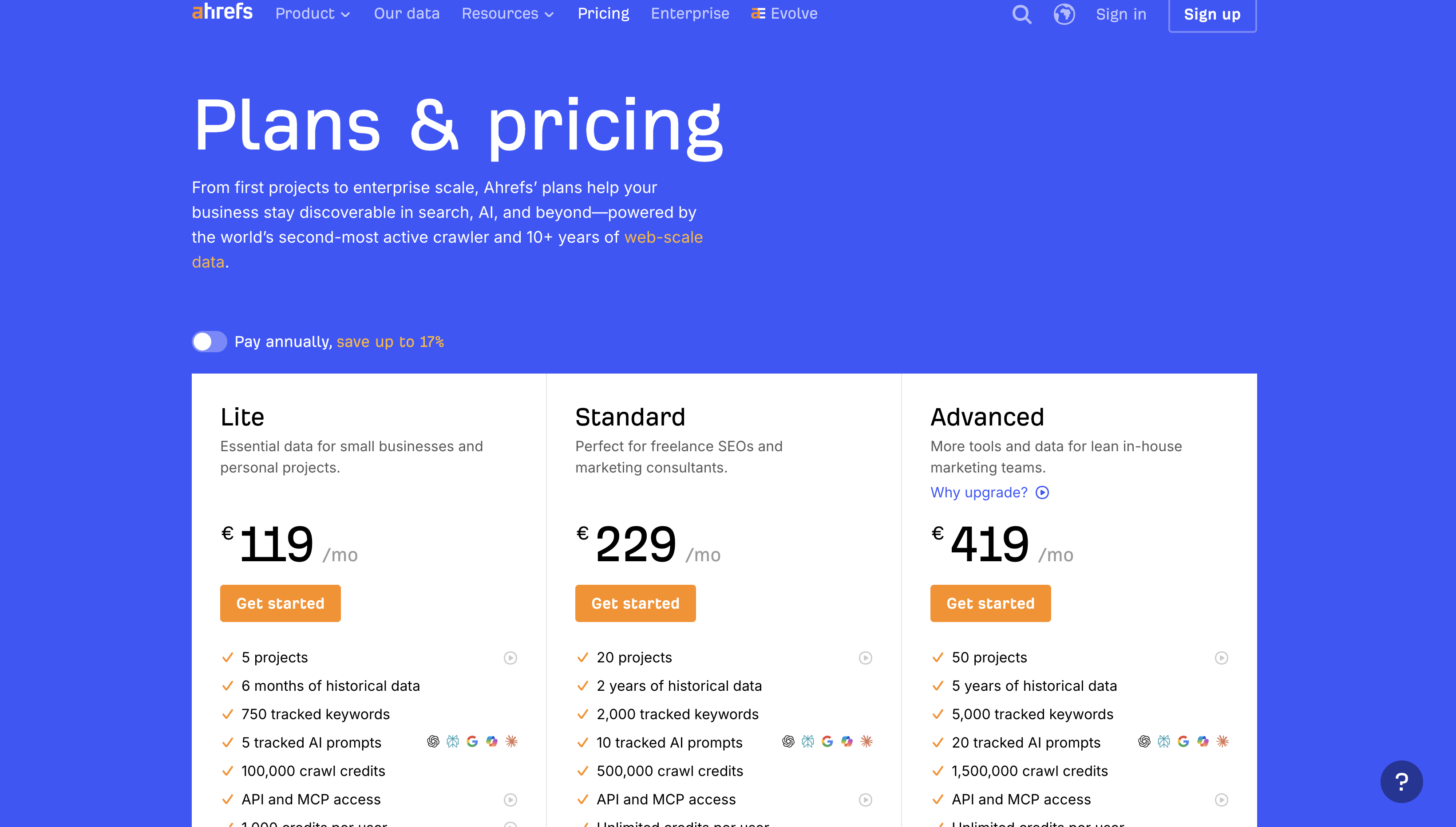
Ahrefs is the interesting counterexample. The page shows five paid tiers plus a free option, more than this guide recommends, and it works because every price is public and the "Compare plans & features" table is organized by product area so a buyer can find the one capability they care about. If you have to run more tiers than you'd like, this is how to make the table carry the load.
Common SaaS Pricing Page Mistakes
Too Many Tiers
More than three to four options creates decision paralysis (or, "analysis paralysis"). If you have more plans, use a "Compare All Plans" expandable section rather than displaying everything at once.
Vague or Jargon-Heavy Copy
Technical feature names without context confuse buyers. "Advanced API access" means nothing to someone who does not know what they would use it for. Translate features into outcomes wherever possible.
Hidden Enterprise Pricing With No Path Forward
"Contact Us" with no context frustrates high-intent buyers. Providing a "starting at" price or price range helps qualify leads and reduces friction for serious prospects.
Weak Mobile Experience
Pricing tables often break on mobile devices. Tier cards and comparison tables need special attention on smaller screens; in the B2B SaaS sites we audit, a meaningful share of pricing page visits arrive on phones during early research, and a table that requires horizontal scrolling loses them.
Missing Annual Billing Toggle
Many buyers prefer annual discounts. A toggle lets them compare monthly and annual options without leaving the page, and highlighting the savings encourages longer commitments.
How to Measure SaaS Pricing Page Performance
Conversion Rate by Tier
Track which tier visitors select most often. If your "Most Popular" badge sits on your mid-tier but most conversions happen on your entry tier, something is misaligned.
Scroll Depth and Heatmaps
Use scroll depth and heatmaps to see where visitors drop off or spend time. If they never reach your CTA or get stuck on the comparison table, you have found a friction point worth investigating.
Time to First CTA Click
Measure how quickly visitors engage with a pricing CTA. Longer times may indicate confusion or friction in the page layout.
Sales-Qualified Lead Quality
For enterprise tiers with "Contact Sales" CTAs, track whether leads from the pricing page convert at higher rates than leads from other sources.
How to Optimize and Test Your Pricing Page
1. Run Structured A/B Tests
Test one variable at a time, whether that is CTA copy, tier order, or price anchoring. Give tests enough time to reach statistical significance before drawing conclusions. On lower-traffic sites, our guide to B2B conversion rate optimization covers what to do when a valid test would take months.
2. Prioritize Tests by Revenue Impact
Focus on changes that affect the highest-traffic tiers or the largest revenue opportunities first. A 5% improvement on your most popular tier matters more than a 20% improvement on a tier nobody selects.
3. Iterate on Copy Before Layout
Copy changes are faster to test and often have larger impact than design overhauls. Start with headlines and CTAs before investing in structural changes.
When to Redesign Your SaaS Pricing Page
Optimization has limits, and a few signals mean the page needs a full redesign rather than another test:
- Product changes: New features, new tiers, or pricing model shifts require page updates
- Declining conversion rates: Sustained drops suggest the page no longer resonates with your audience
- Brand refresh: A new visual identity extends to your highest-stakes pages, so protect your rankings during the transition
- Competitive pressure: If competitors have clearer pricing pages, you are at a disadvantage
- Scaling up: Pages built for early-stage startups often need restructuring as you move upmarket
Build a Pricing Page That Converts With Curio Digital
Your pricing page is one of the highest-leverage pages on your site. At Curio Digital, we design and build conversion-focused websites for B2B SaaS companies, with pricing pages that guide visitors toward action.
As a Webflow Enterprise Partner with 100+ sites launched, we bring both design expertise and technical precision to every project.
FAQs About SaaS Pricing Pages
Should you show enterprise pricing publicly on a SaaS pricing page?
Showing a "starting at" price or price range can qualify leads and reduce friction. Fully custom pricing often still requires a contact form, but giving visitors some context helps them self-select.
How often should you update your SaaS pricing page?
Review quarterly and update when pricing, features, or positioning changes. Stale pricing pages create confusion and erode trust.
Is Webflow a good platform for building a SaaS pricing page?
Webflow offers flexibility for complex layouts like comparison tables and toggles, and marketing teams can iterate without developer dependency.
Does every SaaS company need a public pricing page?
Most SaaS companies benefit from public pricing. Enterprise-only products with fully custom deals may use a "request a quote" approach instead, though even then, providing context helps qualify inbound leads.
What's next?




Let's build something worth finding.
Every engagement starts with a conversation. We'll learn about your business, your buyers, and where your website is losing them.